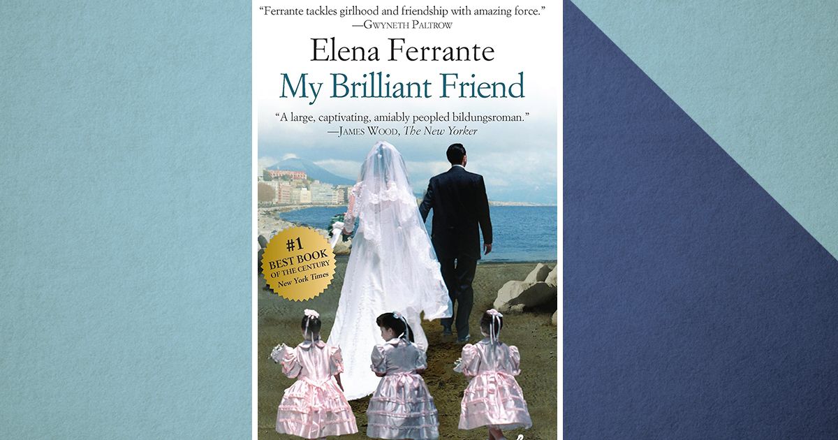
The Unspoken Flaw in the New Elena Ferrante Cover—Is It a Marketing Blunder?
Elena Ferrante's new book cover has left readers puzzled, but it’s not the design they expected—it’s the missed connection to her legacy. What went wrong?

There’s a question hanging over the latest Elena Ferrante release that few are asking, and fewer are answering: What happened to the cover? The famed Italian novelist’s books have always been more than just stories—they’re cultural artifacts, dense with symbolism and layered in secrecy. So, when the new cover hit the shelves, it felt like an uncomfortable rupture. Was this really the image of Ferrante’s work, or was it a distraction from something far more vital?
We’ve grown accustomed to Ferrante’s covers. Each one—a careful, enigmatic piece of art—seemed to hold a key to the mystery at the heart of her writing. The images, often cryptic, subtle, and evocative, always teased the idea that there was something hidden, something deep and unknowable within. But this time, the design is jarring. It’s not unsettling in the way Ferrante’s writing is; it’s a missed opportunity, a misstep that does not align with the atmosphere her words create.
A Question of Identity
Book covers are more than just wrappers for words; they’re the first promise of what the reader is about to experience. And with Ferrante, that promise has always been both intriguing and elusive. Her covers, which once whispered of profound narratives cloaked in Italian landscapes, now feel like they’re trying too hard to fit a mold, to please a market that may not fully understand what makes her work so magnetic.
Ferrante’s books are laced with questions about identity—about who we are and who we let the world think we are. Her covers, too, carried that same tension, the same ambiguity. But now? The shift feels too sharp, almost like an attempt to brand the author in a way that her readers never intended.
The Audience’s Silent Demand
What Ferrante has always done is speak to the disquiet of everyday existence, the discomfort of being a woman in a world that demands so much of your soul and then still asks for more. It’s the raw truth of these stories that has made Ferrante a global phenomenon. But here lies the rub: In an age of increasing commodification, where every book is a product and every author an image, Ferrante’s silent rebellion against definition was perhaps the thing that resonated most. Her covers told us as much about the author as the content within—but this new cover? It’s hard to look at it and not think, Who decided this was Ferrante?
What’s worse, the design feels almost too safe. The ambiguity, the layers of meaning, the quietly unsettling beauty—those were the Ferrante trademarks. So, what is the publishing industry trying to say with this cover? Perhaps it’s too much about fitting into the current cultural zeitgeist and too little about the world Ferrante’s prose conjures: one that’s anything but neat, clean, or defined.
We are left with a disconcerting question: Can we continue to respect an author whose visual representation seems to betray the essence of her writing? Or, is the literary world simply too quick to box in the intangible?
There’s still time for answers, but in the meantime, one thing is clear: this cover is a call for reflection. It may not be the cover Ferrante deserved, but perhaps it is the cover we, as readers, are willing to settle for.
Explore more
When “107 Days” Meets Outcry: Harris’s Book Tour Interrupted
The microphone crackled to life, and before Harris could finish her opening...
Whispers in the Shadows: Why Holly Black’s Sequel Is a Dark Invitation We Can’t Ignore
The night isn’t just dark—it’s ravenous, greedy, and it’s coming for you....
Why Stephenie Meyer’s Regret About Edward Changes Everything You Thought You Knew
The moment Stephenie Meyer admitted she wouldn’t pick Edward Cullen today, a...
When Fear, Fury & Feathers Collide: Cinema, Superheroes, and a Confessional Album
Open with tension—the kind that threads through a scream, a reveal, and...


Leave a comment